Data Alerts
On this page:
About Data Alerts
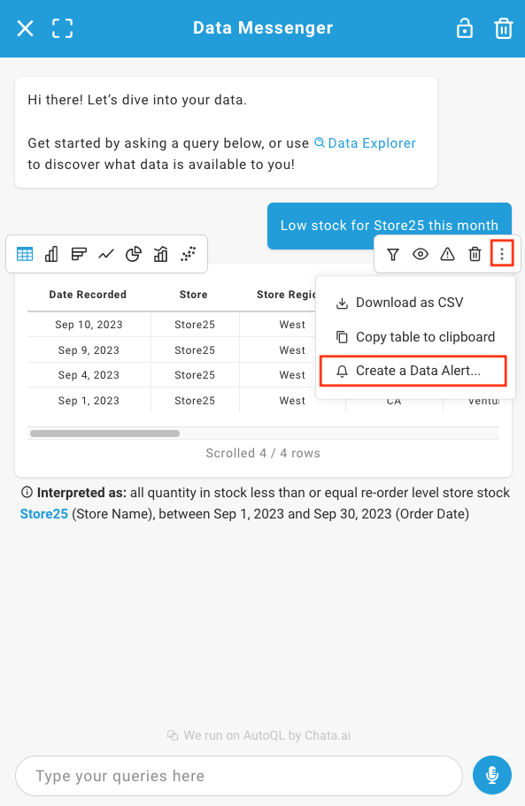
Data Alerts is a large UI component that shows a list of configured Data Alerts and contains a modal that enables the creation of new Data Alerts.
Tip: This widget works best if placed within a full page.
Custom Data Alerts are User-Level Data Alerts, which means they can be created, edited and deleted by the End User, from the widget itself.
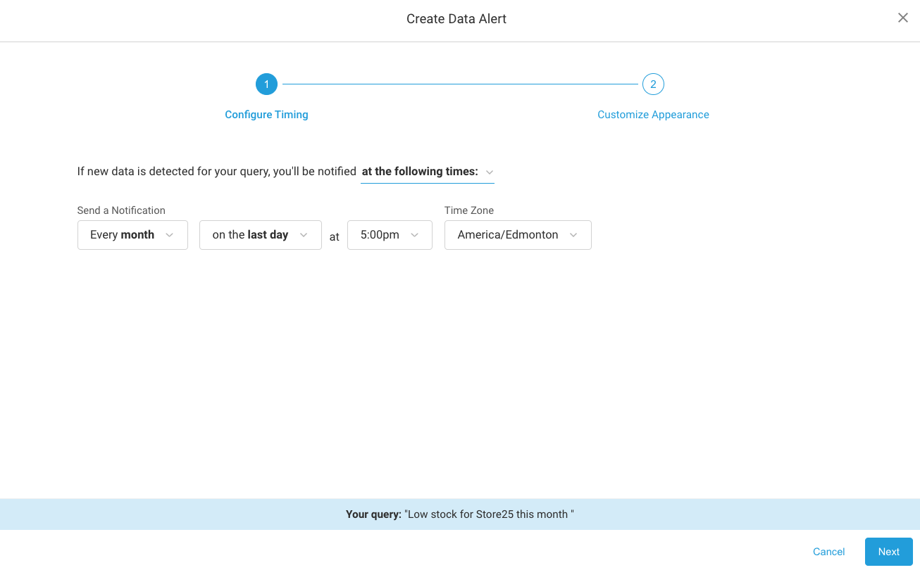
To create a new Data Alert or edit an existing one, a modal that contains a simple setup workflow is also included within this widget. Within the modal, the user is prompted to set up a customized Data Alert by following this series of steps:
- Configure Timing
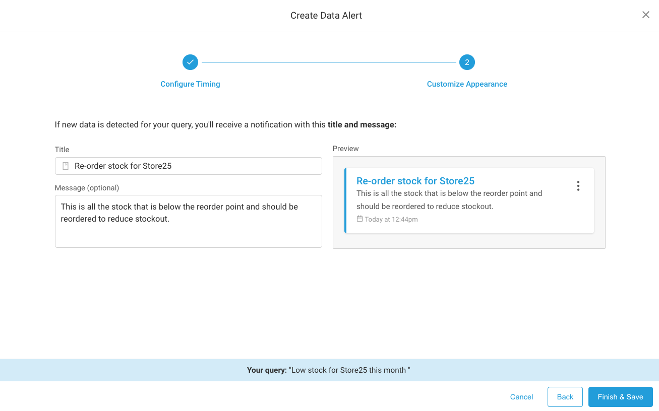
- Customize Appearance
To set up an alert, the user must query the parameters in either Data Messenger or a Dashboard tile to create their Alert.
Next, the user will be prompted to schedule the frequency at which they wish to be notified if the conditions of their new Data Alert are met. They can opt to be notified right away (when the event happens), or be notified every time that event happens. They can also set up the Alert so they are only notified at specific intervals: Daily, Weekly, or Monthly.
Next, the user sets up their Alert Custom Preferences. Here, the user can use natural language to specify the data response they wish to receive when their Alert is triggered. They can also add a customized message to provide helpful context when the notification is received.
Setting Up Data Alerts
The following sections in this document contain detailed information about how to customize the properties of this widget.
To get started, simply import the DataAlerts component and pass in the required authentication option:
Options
| Option Name | Data Type | Default Value |
|---|---|---|
| authentication (required) | Object | {} |
| themeConfig | Object | {} |
| onErrorCallback | Function | (error) => {} |
onErrorCallback(error): A callback for when an error occurs in the component.
authentication Option
| Key | Value Type | Description |
|---|---|---|
| token | String | Your valid JWT encrypted with your user ID and customer ID. For more information on how to create this token, please see: Create JSON Web Tokens (JWT) |
| apiKey | String | Your API key. For more information on how to obtain this, please see: Manage API Keys |
| domain | String | The base URL for your API. |
themeConfig Option
| Key | Value Type | Description |
|---|---|---|
| theme | String: 'light' | | 'dark' | 'light' |
| accentColor | String | '#28a8e0' |
| fontFamily | String | 'sans-serif' |
| chartColors | Array | 7E9', '#A5CD39', '#DD6A6A', '#FFA700', '#00C1B2'] | `t |
theme: Currently there are two options: light theme and dark theme. In addition to changing the overall theme, you can also change the accent color using the accentColor option.
accentColor: Primary accent color used for buttons, link, or hover effects. Note that the visualization (table and chart) colors will not be affected here.
fontFamily: Customize the font family to the provided font wherever possible. Accepts any CSS font family that is available, and if none is provided, will default to Sans-Serif.
chartColors: Array of color options for the chart visualization themes, starting with the most primary. You can pass any valid CSS color format in here, however it is recommended that the color is opaque (ex. "#26A7E9", "rgb(111, 227, 142)", or "red"). Charts will always apply the colors in order from first to last. If the visualization requires more colors than provided, all colors will be used and then repeated in order.
Examples
Updated 11 months ago