Notification Feed
On this page:
About the Notification Feed
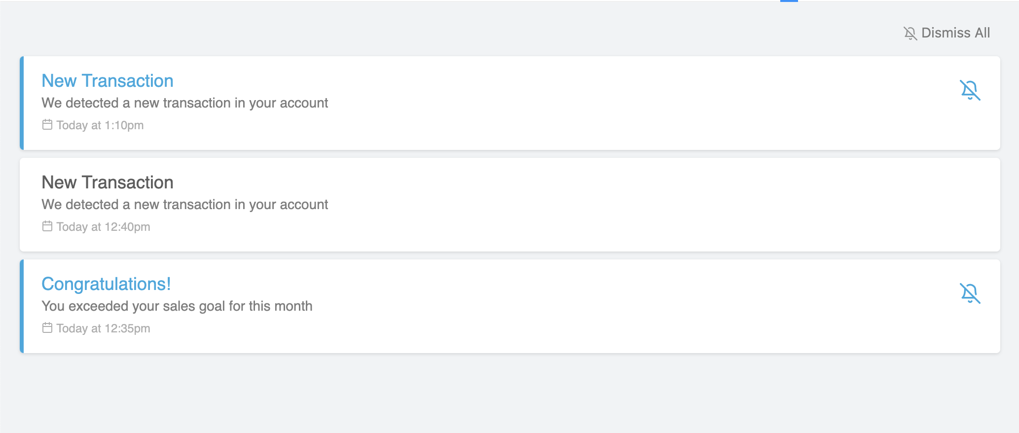
Notification Feed is a large UI component that lists the notification history starting with the most recent.

From this widget, the user will be able to see new notifications, dismiss them (either individually or in bulk), and click to expand and view the details of each notification.
AutoQL doesn't store any confidential company dataThe data returned in a notification will need to be stored in the Integrator's company database and passed into the relevant front end component.
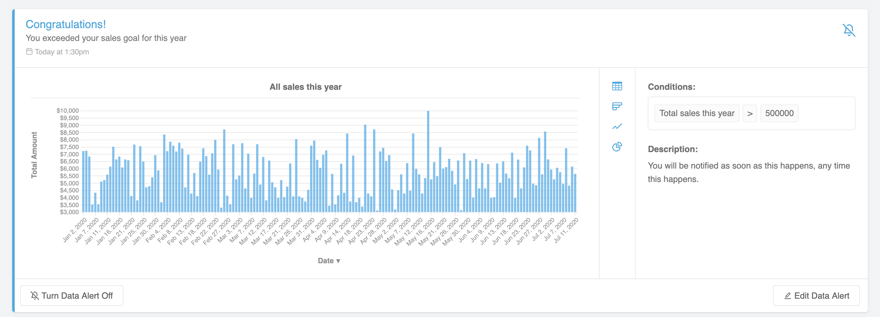
Since AutoQL doesn't store any confidential company data, the data returned in the notification will need to be stored in your own company database. That data can then be passed into this React Component, and viewed inside the NotificationDetails drop-down (see example below).

Setting Up the Notification Feed
The following sections in this document contain detailed information about how to customize the properties of this widget.
To get started, simply import the NotificationFeed component and pass in the required authentication option:
To enable the user to view the data returned from each notification, the data return object from the notification webhook must be stored somewhere in your company database. This can then be passed to the current expanded notification via the activeNotificationData option:
Options
| Option Name | Data Type | Default Value |
|---|---|---|
| authentication (required) | Object | {} |
| themeConfig | Object | {} |
| onExpandCallback | Function | (notification) => {} |
| onCollapseCallback | Function | (notification) => {} |
| activeNotificationData | Object | undefined |
| showNotificationDetails | Boolean | true |
| onErrorCallback | Function | (error) => {} |
| onSuccessCallback | Function | (message) => {} |
onExpandCallback(notification): Called when the user expands a notification. This is needed to fetch the details from the notification webhook, which can then be passed into the activeNotificationDetails option.
onCollapseCallback(notification): Called when the user collapses a notification. For optimal performance, it's recommended that activeNotificationDetails be cleared when a notification is collapsed.
activeNotificationData: The data return object from the notification webhook. This is the same data that should be stored in your company database and is used to display the details inside of the notification. The whole object can be passed in here and the widget will offer different display options depending on the data structure.
Fetching your notification dataIf
activeNotificationDatais undefined (while you are fetching the notification data from your database), a loading indicator will be displayed in its place by default.
showNotificationDetails: If you do not wish to store the notification details, you can turn off this feature by setting showNotificationDetails to false. In this case, notifications will not be expandable when clicked.
onErrorCallback(errorObject): A callback for when an error occurs in the component.
onSuccessCallback(message): A callback for when an action succeeds, such as when a setting within a notification has been successfully changed (when editing or enabling the notification via the "turn this notification back on" button).
authentication Option
| Key | Value Type | Description |
|---|---|---|
| token | String | Your valid JWT encrypted with your user ID and customer ID. For more information on how to create this token, see: Create JSON Web Tokens (JWT) |
| apiKey | String | Your API key. For more information on how to obtain this, please see: Manage API Keys |
| domain | String | The base URL for your API. |
themeConfig Option
Key | Value Type | Description |
|---|---|---|
theme | String: 'light' | | 'dark' | 'light' |
accentColor | String | '#28a8e0' |
fontFamily | String | 'sans-serif' |
chartColors | Array | ', '#DD6A6A', '#FFA700', '#00C1B2']
|
theme: Currently there are two options: light theme and dark theme. In addition to changing the overall theme, you can also change the accent color using the accentColor option.
accentColor: Primary accent color used for buttons, link, or hover effects. Note that the visualization (table and chart) colors will not be affected here.
fontFamily: Customize the font family to the provided font wherever possible. Accepts any CSS font family that is available, and if none is provided, will default to Sans-Serif.
chartColors: Array of color options for the chart visualization themes, starting with the most primary. You can pass any valid CSS color format in here, however it is recommended that the color is opaque (ex. "#26A7E9", "rgb(111, 227, 142)", or "red"). Charts will always apply the colors in order from first to last. If the visualization requires more colors than provided, all colors will be used and then repeated in order.
Examples
Updated 8 months ago
