Options Toolbar
On this page:
About Options Toolbar
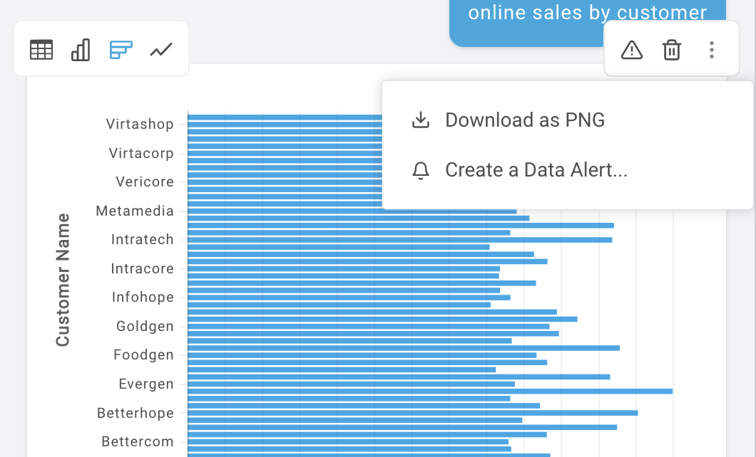
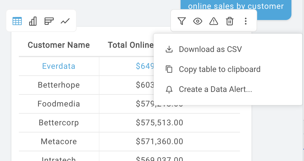
The Options Toolbar contains a series of buttons that enable various actions that can be performed on a query response dataset (also known as a "data response"). Depending on the current display type of the data, this toolbar will show the options available for the user to select.


Setting up Options Toolbar
The Options Toolbar works as a sibling component to QueryOutput. The QueryOutput ref must be passed to OptionsToolbar, and the OptionsToolbar ref must be passed to QueryOutput. By doing this, each component can communicate with each other without the need for the developer to handle state changes outside of the components.
import React, { Component} from 'react'
import { OptionsToolbar, QueryOutput } from 'react-autoql';

import 'react-autoql/dist/autoql.esm.css'

export default class App extends Component {
  ...

  render = () => {
    return (
      <QueryOutput
        ref={r => this.queryOutputRef = r}
        optionsToolbarRef={this.optionsToolbarRef}
        authentication={{
          apiKey="your-api-key"
          domain="https://yourdomain.com"
          token="your-jwt-token"
        }}
        queryResponse={responseFromAPI}
      />
      <OptionsToolbar
        ref={r => this.optionsToolbarRef = r}
        responseRef={this.responseRef}
        authentication={{
          apiKey="your-api-key"
          domain="https://yourdomain.com"
          token="your-jwt-token"
        }}
      />
    )
  }
}
Available Options
| Option | Availability | Description |
|---|---|---|
| Filter table | 'table' display type only, and if row count is greater than 1 | Shows/hides header filter inputs in a table view |
| Show/hide columns | 'table' display type only | Opens modal where user can select/deselect columns they want to make visible or hidden in the dataset. These settings are persisted |
| Report a problem | always available | Opens menu where user can select a problem found with the data, or choose to write their own feedback |
| Delete data response | always available | Option with a callback the developer can implement a delete function with |
| Download as CSV | 'table' or 'pivot_table' display types | Downloads a CSV file of the currently selected table (regular or pivot) |
| Download as PNG | any chart display type ('bar', 'column', 'line', 'pie', 'stacked_bar', 'stacked_column', 'stacked_line', 'bubble', 'heatmap') | Downloads a PNG image of the currently selected chart |
| Copy table to clipboard | 'table' or 'pivot_table' display types | Copies the comma-delimited data to the clipboard |
| View generated SQL | always available | Opens a modal where the user can view the generated SQL statement used to query the data |
| Create a Data Alert | always available | Opens a modal where the user can create a Data Alert from the query, allowing the user to get notified whenever the data changes or custom conditions are met. |
NoteThe developer can also choose to disable any of these options manually using the props.
Props
| Prop Name | Data Type | Default Value |
|---|---|---|
| responseRef (Required) | React Ref | - |
| queryResponse (Required) | Object | - |
| authentication (Required) | Object | {} |
| autoQLConfig | Object | {} |
| onCSVDownloadStart | Function | () => {} |
| onCSVDownloadFinish | Function | () => {} |
| onCSVDownloadProgress | Function | () => {} |
| onSuccessAlert | Function | () => {} |
| onErrorCallback | Function | () => {} |
| enableDeleteBtn | Boolean | false |
| deleteMessageCallback | Function | () => {} |
| rebuildTooltips | Function | - |
| popoverParentElement | HTML Element | - |
responseRef: The ref of the QueryOutput component. This is used to call the functions in the QueryOutput class which perform each action. It is also used to get the current display type and query response data structure to determine which options are currently available.
authentication Prop
| Key | Value Type | Description |
|---|---|---|
| token | String | Your valid JWT encrypted with your user ID and customer ID. For more information on how to create this token, please visit the "Security" section of our docs. |
| apiKey | String | Your API key. For more information on how to obtain this, please visit the "Security" section of our docs. |
| domain | String | The base URL for your API. For more information on how to obtain this, please visit the "Security" section of our docs. |
autoQLConfig Prop
| Key | Value Type | Default value | Description |
|---|---|---|---|
| debug | Boolean | false | if set to true, it will enable the "View generated SQL" option |
| enableColumnVisibilityManager | Boolean | true | if set to false, it will disable the "Show/hide columns" option |
| enableCSVDownload | Boolean | true | if set to false, it will disable the "Download as CSV" option |
| enableReportProblem | Boolean | true | if set to false, it will disable the "Report problem" option |
| enableNotifications | Boolean | false | if set to true, it will enable the "Create a Data Alert" option |
onCSVDownloadStart: ({ id, queryId, query }) => {}: Function called when a CSV download starts. The id is a randomly generated uuid, which can be used to reference the correct response component when the download is finished.
onCSVDownloadProgress: ({ id, progress }) => {}: Function called when a file download progress event is triggered. id is the same ID provided in onCSVDownloadStart, and progress is the percentage completed.
onCSVDownloadFinish: ({ id, exportLimit, limitReached }) => {}: Function called when the CSV download is complete. id is the same ID provided in the previous callbacks, exportLimit is the maximum file size in MB that AutoQL is able to export, and limitReached is returned true if the export reached the maximum limit.
onSuccessAlert: (message) => {}: Function called when an action completes successfully. The message can be used in a toast or snackbar to display to the user.
onErrorCallback: (error) => {}: Function called when an action is unsuccessful. The error message can be used in a toast or snackbar to display to the user.
enableDeleteBtn: If set to true, the delete option will be available.
deleteMessageCallback: () => {}: Function called if enableDeleteBtn is true and user clicks on the option.
rebuildTooltips: () => {}: react-autoql uses ReactTooltip for all tooltips. In some cases we will need to rebuild the tooltips if the options have changed due to changing display types or rows. If not provided, the component will call ReactTooltip.rebuild(). If you would prefer to debounce this function due to performance, you can provide your own function here and it will use that one instead.
popoverParentElement: This prop is used to determine the bounds for the option dropdown menus. If not provided, it will default to the document body. If provided, the collision will be calculated with the bounds of the provided element.
Examples
import React, { Component} from 'react'
import { OptionsToolbar, QueryOutput } from 'react-autoql';

import 'react-autoql/dist/autoql.esm.css'

export default class App extends Component {
  constructor(props) {
    super(props)

    this.queryOutputRef = React.createRef()
    this.optionsToolbarRef = React.createRef()
  }

  ...

  render = () => {
    return (
      <QueryOutput
        ref={r => this.queryOutputRef = r}
        optionsToolbarRef={this.optionsToolbarRef}
        authentication={{
          apiKey="your-api-key"
          domain="https://yourdomain.com"
          token="your-jwt-token"
        }}
        queryResponse={responseFromAPI}
      />
      <OptionsToolbar
        ref={r => this.optionsToolbarRef = r}
        responseRef={this.responseRef}
        authentication={{
          apiKey="your-api-key"
          domain="https://yourdomain.com"
          token="your-jwt-token"
        }}
        onCSVDownloadStart={this.onCSVDownloadStart}
        onCSVDownloadFinish={this.onCSVDownloadFinish}
        onCSVDownloadProgress={this.props.onCSVDownloadProgress}
        onSuccessAlert={this.props.onSuccessAlert}
        onErrorCallback={this.props.onErrorCallback}
        enableDeleteBtn={false}
        deleteMessageCallback={() => {
          // Custom function to remove the data response
        }}
      />
    )
  }
}
Updated 8 months ago
