Data Messenger
Deliver the power of AutoQL to your users through Data Messenger, a state-of-the-art conversational interface you can easily build into your existing application.
On this page:
About Data Messenger
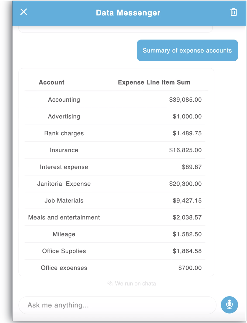
Data Messenger is a conversational user interface (CUI). It is a flexible frontend widget that can be implemented and accessed within an existing application or software interface. Data Messenger enables users to interact conversationally with their data by entering natural language queries to receive information from their database (or more simply, by asking questions in their own words to receive data-related responses).
Throughout this document, the words "Data Messenger" and "widget" are used interchangeably. All widget components are open source, so Data Messenger is highly customizable in terms of both function and design.

Setting Up Data Messenger
To begin, the Data Messenger widget must be initialized through the 'init' method. All of the authentication configuration (referenced in detail below) will need to be set during initialization. Any additional functional or UI options can also be set here.
<body>
  <div id="data-messenger">
  </div>

  <script>
    var dataMessenger = new DataMessenger('#data-messenger', {
        authentication: {
            token: 'yourToken',
            apiKey: 'your_api_key',
            domain: 'https://yourdomain.com'
        },
        placement: 'right',
        resizable: false,
        onMaskClick: function(dataMessenger){
            dataMessenger.closeDrawer();
        },
        width: 550
    })
  </script>
</body>
Options
Data Messenger can be highly customized through the range of options below. To update the widget with a new configuration, you can begin by updating the options inside the DataMessenger object:
dataMessenger.setOption('authentication', {
	apiKey: 'yourAPIKey',
	domain: '[email protected]',
	token: 'your-token',
})
dataMessenger.setOption('enableExploreQueriesTab', false)
dataMessenger.setOption('maxMessages', 6)| Option Name | Data Type | Default Value |
|---|---|---|
| authentication | Object | {} |
| onHandleClick | Function | () => {} |
| placement | String: 'left' || 'right' || 'top' || 'bottom' | 'right' |
| enableExploreQueriesTab | Boolean | true |
| width | String || Number | 500 |
| height | String || Number | 350 |
| resizable | Boolean | true |
| title | String | 'Data Messenger' |
| userDisplayName | String | 'there' |
| introMessage | String | 'Hi ${userDisplayName}! I'm here to help you access, search and analyze your data.' |
| queryQuickStartTopics | Array of Objects | undefined |
| inputPlaceholder | String | 'Type your queries here' |
| showMask | Boolean | true |
| maskClosable | Boolean | true |
| onMaskClick | Function | onHandleClick |
| shiftScreen | Boolean | false |
| onVisibleChange | Function | () => {} |
| showHandle | Boolean | true |
| handleStyles | Object | {} |
| maxMessages | Number | undefined |
| clearOnClose | Boolean | false |
| enableVoiceRecord | Boolean | true |
| autocompleteStyles | Object | {} |
| autoQLConfig | Object | {} |
| dataFormatting | Object | {} |
| themeConfig | Object | {} |
onHandleClick: Callback when the handle of the widget is clicked.
placement: Determines the edge of the screen where Data Messenger is placed.
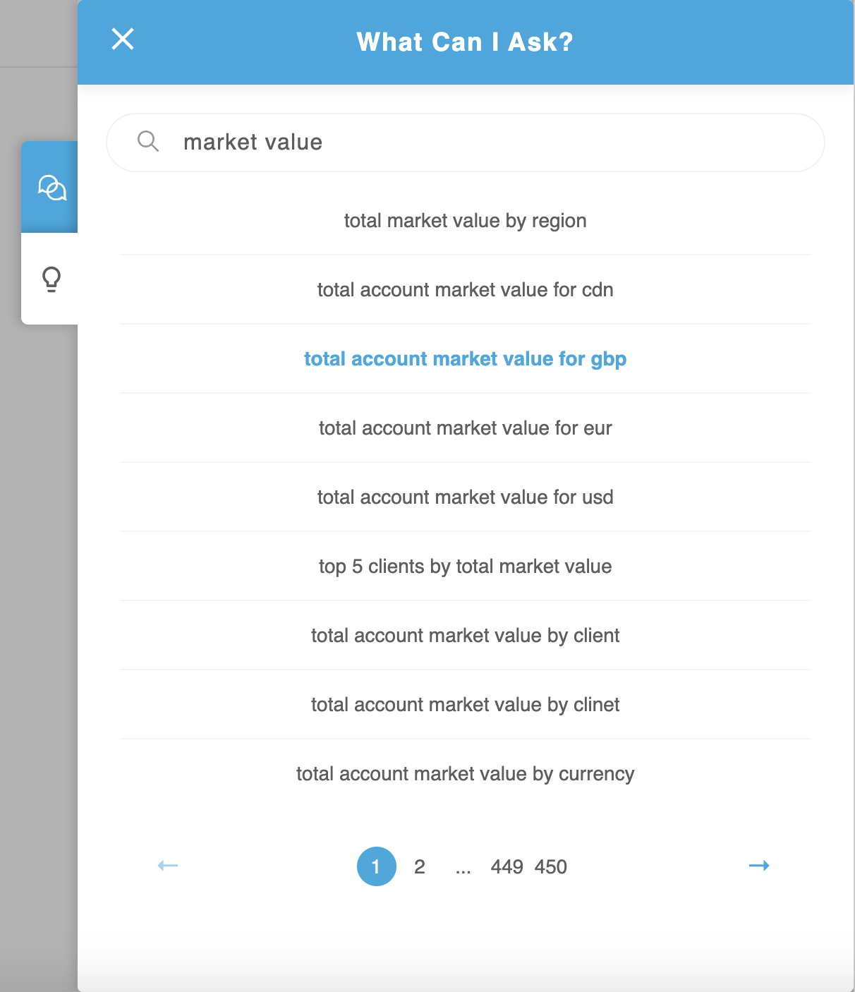
enableExploreQueriesTab: Explore Queries is a separate view within Data Messenger that provides a custom, searchable catalogue of natural language queries to get your users started, fast. To use it, the user simply types in a keyword or topic to search for related queries. Queries related to the input from the user are returned and the user can click on any query they wish to run. The selected query will then be run automatically within the default Data Messenger view.

width: Set the widget width in pixels. If the value is larger than the screen width, it will default to the screen width. This value will only be applied for placements "left" and "right". The value will be ignored for "top" and "bottom" placements. If the resizable prop is "true", this value will serve as the initial width only.
height: Set the height of the widget in pixels. If the value is larger than the screen height, it will default to the screen height. This value will only be applied for "top" and "bottom" placements. This value will be ignored for "left" and "right" placements. If the resizable prop is "true", this value will serve as the initial height only.
resizable: If this option is "true", Data Messenger will be dynamically resizable. Users can easily change the size of the widget by clicking and dragging from the edge.
title: Text that appears in the header of the default Data Messenger view. You must provide an empty string if you do not want text to appear here, otherwise the default text (Data Messenger) will apply.
userDisplayName: Name used in the intro message (ex. "Hi Nikki!"). You can customize this value using names from your own database.
introMessage: Customize the default intro message using your own brand voice and custom copy. The userDisplayName option will be ignored if this is provided.
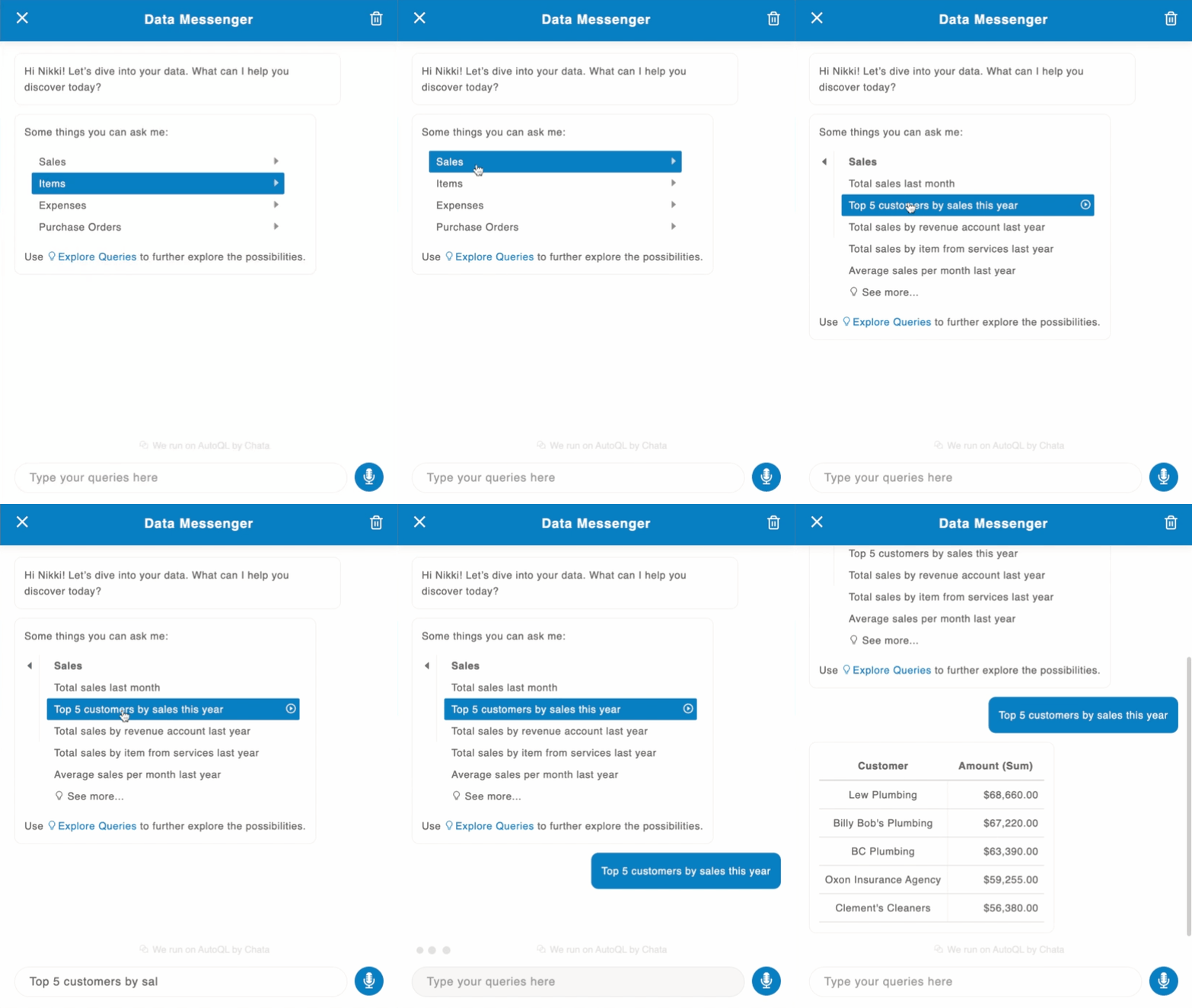
queryQuickStartTopics: An optional prop that (when provided) will generate a list of predefined query topics and a concise list of natural language queries related to each topic. The user can simply click on a query to get started.

The structure of the queryQuickStartTopics array is as follows:
[
  {
    topic: 'Sales',
    queries: [
      'Total sales last month',
      'Top 5 customers by sales this year',
      'Total sales by revenue account last year',
      'Total sales by item from services last year',
      'Average sales per month last year',
    ]
  },
  {
    topic: 'Items',
    queries: [
      'Top 5 items by sales',
      'Which items were sold the least last year',
      'Average items sold per month last year',
      'Total profit per item last month',
      'Total items sold for services last month',
    ]
  }
]inputPlaceholder: Customize the placeholder for the Query Input (natural language query search bar).
showMask: Whether to show the mask (mask presents as a grayed out overlay when Data Messenger is open).
maskClosable: If this value is set to true, the onHandleClick function will be called when the mask is clicked. If showMask is false, this prop will be ignored.
onMaskClick: If showMask is true, this is the callback for when the mask is clicked.
shiftScreen: Whether to shift the whole screen over when the widget opens/closes.
onVisibleChange: Callback after the widget closes or opens.
showHandle: Determines whether to show the handle on the edge of the interface. If you do not wish to show the handle, you can use your own custom button and control the widget with the isVisible option.
handleStyles: Specify custom CSS styles for the handle. Must pass in a valid JSX CSS style object (ex. { backgroundColor: '#000000' }).
maxMessages: Maximum number of messages that can be displayed in the Data Messenger interface at one time. A message is any input or any output in the interface. This means a query entered by a user constitutes one message, and the response returned in the Data Messenger interface constitutes another message. If a new message is added and you have reached the maximum, the oldest message will be erased. Note: Any number smaller than 2 will be ignored.
clearOnClose: Determines whether or not to clear all messages when the widget is closed. Note: The default intro message will appear when you reopen the widget after closing it.
enableVoiceRecord: Enables the voice-to-text button. Note: The voice-to-text feature uses Web Speech API, so this feature is only available for Chrome users. It will render on other browsers but will not be functional.
autocompleteStyles: Object with JSX CSS to style the auto-complete popup (ex. { borderRadius: '4px' }).
authentication Option
| Key | Value Type | Description |
|---|---|---|
| token | String | Your valid JWT encrypted with your user ID and customer ID. For more information on how to create this token, please visit the "Security" section of our docs. |
| apiKey | String | Your API key. For more information on how to obtain this, please visit the "Security" section of our docs. |
| domain | String | The base URL for your API. For more information on how to obtain this, please visit the "Security" section of our docs. |
autoQLConfig Option
| Key | Value Type | Description |
|---|---|---|
| enableAutocomplete | Boolean | true |
| enableQueryValidation | Boolean | true |
| enableQuerySuggestions | Boolean | true |
| enableDrilldowns | Boolean | true |
| enableColumnVisibilityManager | Boolean | true |
| debug | Boolean | false |
enableAutocomplete: Automatically populates similar query suggestions as users enter a query, so they get results more quickly and easily. If enabled, suggested queries will begin to appear above the Query Input bar as the user types.
enableQueryValidation: Catches and verifies references to unique data, so users always receive the data they need. If enabled, the natural language query entered by a user will first go through the validate endpoint. If the query requires validation (ex. the input contains reference to a unique data label), suggestions for that label will be returned in a subsequent message, allowing the user to verify their input before executing their query.
For example: If you query, 'How much money does Nikki owe me?', validation may detect that there is no 'Nikki' label, but there are labels called 'Nicki', and 'Nik' in your database. The message will then let you select the appropriate label and run the corresponding query.
If this value is false, the query will bypass the validate endpoint and be sent straight to the query endpoint.
enableQuerySuggestions: Enables option for user to clarify meaning in cases where their original query lacked context or could be interpreted in multiple separate ways. If enabled, in cases where the query input was ambiguous, a list of suggested queries will be returned for the user to choose from, leading to more efficient and accurate responses. If this is false, a general error message will appear in its place.
enableDrilldowns: When a table or chart element is clicked by a user, a new query will run automatically, allowing the user to "drilldown" into the data to obtain a detailed breakdown of the figure returned by entry. If this is false, nothing will happen when a table or chart element is clicked.
enableColumnVisibilityManager: Column Visibility Manager allows the user to control the visibility of individual columns when query results are returned in a table. Users can access the Column Visibility Manager to adjust their visibility preferences by clicking the "eye" icon in the Options Toolbar and selecting or deselecting columns. Once set, visibility preferences will be persisted. Any future query containing columns that were previously shown or hidden by the user will also reflect these changes. The user can access the Column Visibility Manager to make changes to these visibility preferences at any time.
debug: If this value is true, the user can copy the full query language (QL) statement (ex. SQL statement) that was dynamically generated from their natural language query input by clicking "Copy generated query to clipboard".
dataFormatting Option
| Key | Value Type | Description |
|---|---|---|
| currencyCode | String | 'USD' |
| languageCode | String | 'en-US' |
| currencyDecimals | Number | 2 |
| quantityDecimals | Number | 1 |
| comparisonDisplay | String: 'PERCENT' || 'RATIO' | 'PERCENT' |
| monthYearFormat | String | 'MMM YYYY' |
| dayMonthYearFormat | String | 'll' |
currencyCode: If your data is not in USD, you can specify a different currency code here. All visualizations (tables and charts) will show the default currency formatting for the specified code.
CurrencySetting a currency code does not perform a currency conversion. It only displays the number in the desired format.
languageCode: If the currency code from your country requires letters not contained in the English alphabet in order to show symbols correctly, you can pass in a locale here. For more details on how to do this, visit: https://developer.mozilla.org/en-US/docs/Web/JavaScript/Reference/Global_Objects/NumberFormat
currencyDecimals: Number of digits to display after a decimal point for currencies.
quantityDecimals: Number of digits to display after a decimal point for quantity values.
comparisonDisplay: Format for displaying comparison types (e.g. changes in data). "Percent" will multiply the number by 100 and display a "%" symbol. "Ratio" will display the original number as-is.
monthYearFormat: The format to display the representation of a whole month. (ex. March 2020). Chata.ai defaults to day.js for date formatting, however most Moment.js formatting will work here as well. Please see the day.js docs for formatting options.
dayMonthYearFormat: The format to display the representation of a single day. (ie. March 18, 2020). AutoQL uses day.js for date formatting, however most Moment.js formatting will work here as well. Please see the day.js docs for formatting options.
themeConfig Option
Key | Value Type | Description |
|---|---|---|
theme | String: 'light' | | 'dark' | 'light' |
accentColor | String | light theme: '#28a8e0', dark theme: '#525252' |
fontFamily | String | 'sans-serif' |
chartColors | Array | '#DD6A6A', '#FFA700', '#00C1B2']
|
theme: Color theme for Data Messenger. Currently there are two options: light theme and dark theme. In addition to changing the overall theme, you can also change the accent color using the accentColor option.
accentColor: Primary accent color used in Data Messenger. This is the color of the header, speech-to-text button, and the messages displayed in the interface (both natural language query inputs from users and the associated responses that are generated and returned to the user). The visualization (table and chart) colors will not be affected here.
fontFamily: Customize the font family to the provided font wherever possible. Accepts any CSS font family that is available, and if none is provided, will default to Sans-Serif.
chartColors: Array of color options for the chart visualization themes, starting with the most primary. You can pass any valid CSS color format in here, however it is recommended that the color is opaque (ex. "#26A7E9", "rgb(111, 227, 142)", or "red"). Charts will always apply the colors in order from first to last. If the visualization requires more colors than provided, all colors will be used and then repeated in order.
Methods
openDrawer(): Call this method to open Data Messenger
closeDrawer(): Call this method to close Data Messenger
Examples
<html>
  <head>
    <script src="https://cdn.chata.io/autoql/v<<vanillaVersion>>/autoql-min.js"></script>
  </head>

  <body>
    <div id="data-messenger">
    </div>

    <script>
    	var dataMessenger = new DataMessenger('#data-messenger', {
        authentication: {
            token: 'yourToken',
            apiKey: 'your_api_key',
            domain: 'https://yourdomain.com'
        },
        placement: 'bottom',
        maxMessages: 12,
        userDisplayName: 'Joe',
        showMask: false,
        clearOnClose: true,
        enableVoiceRecord: false,
        autoQLConfig: {
          enableAutocomplete: false
        },
        dataFormatting: {
          currencyCode: 'CAD',
          quantityDecimals: 2,
          monthYearFormat: 'MMMM YYYY',
          dayMonthYearFormat: 'MMMM D, YYYY'
        }
      });
    </script>
  </body>
</html>
Updated 8 months ago
