Data Messenger
Deliver the power of AutoQL to your users through Data Messenger, a state-of-the-art conversational interface you can easily build into your existing mobile application.
On this Page
About Data Messenger
Data Messenger is a conversational user interface (CUI). It is a flexible frontend widget that can be implemented and accessed within an existing application or software interface. Data Messenger enables users to interact conversationally with their data by entering natural language queries to receive information from their database (or more simply, allows users to ask questions in their own words to receive data-related responses).
Throughout this document, the words "Data Messenger" and "widget" are used interchangeably. All widget components are open source, so Data Messenger is highly customizable in terms of both function and design.
Setting Up Data Messenger
Controlled Component
This widget is a controlled component in terms of its visibility. The Integrator is in full control of the visual state of Data Messenger within their application, making it easy to trigger the slide-in or slide-out functionality programmatically.
A note on compatabilityThe Data Messenger component can only be used in SDK version 17 or higher. Further details can be found below.
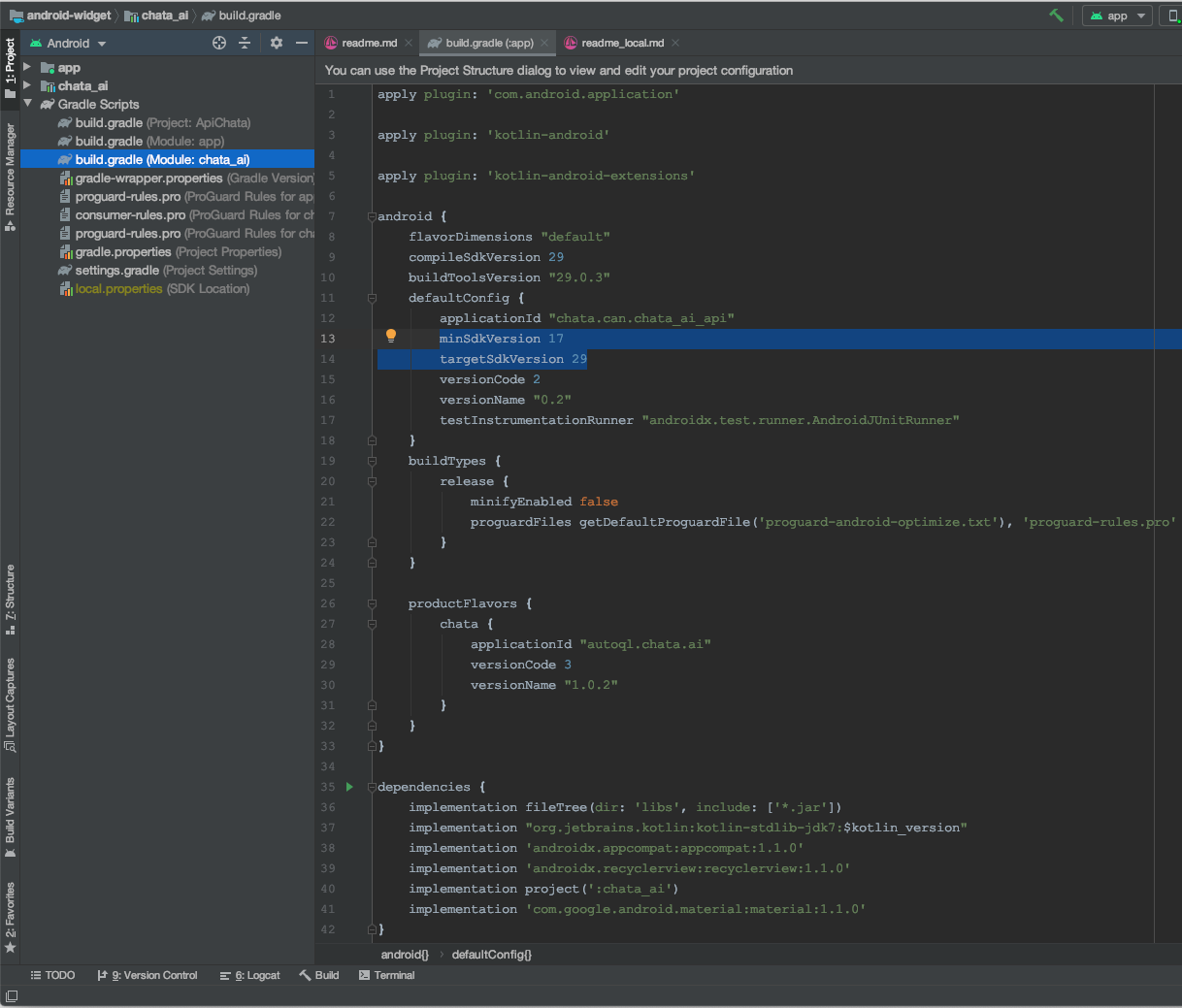
To incorporate the Data Messenger widget, it is first necessary to download it.
There are two ways to download Data Messenger:
- Download directly from the repository.
- Download via Android Studio.
Download directly from the repository
Download Data Messenger directly from the repository here.
Download via Android Studio
Download Data Messenger in Android Studio by opening Android Studio, selecting Check out project from Version Control, and selecting Git.
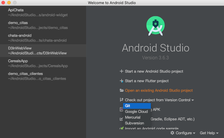
Next, enter https://github.com/chatatechnologies/android-autoql.
Press Test to verify the existence of the repository.
In Directory, select the download destination.
Finally, press Clone to download the repository.

You can now import the Data Messenger component in your project.
Select File > New > Import Module...
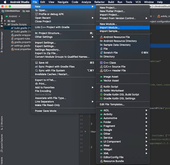
Locate the source code location you downloaded Data Messenger to.
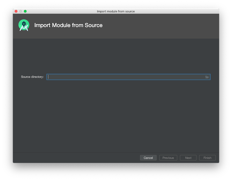
In the downloaded repository folder, select the chata_ai folder.
After opening the chata_ai folder, you should see the following window open:
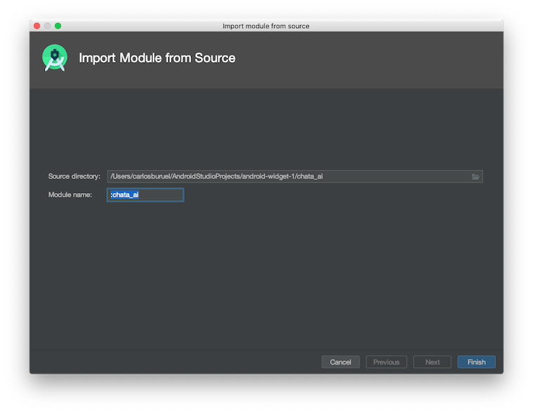
The text inside the Module name box is the name of the module that will be imported into the project.
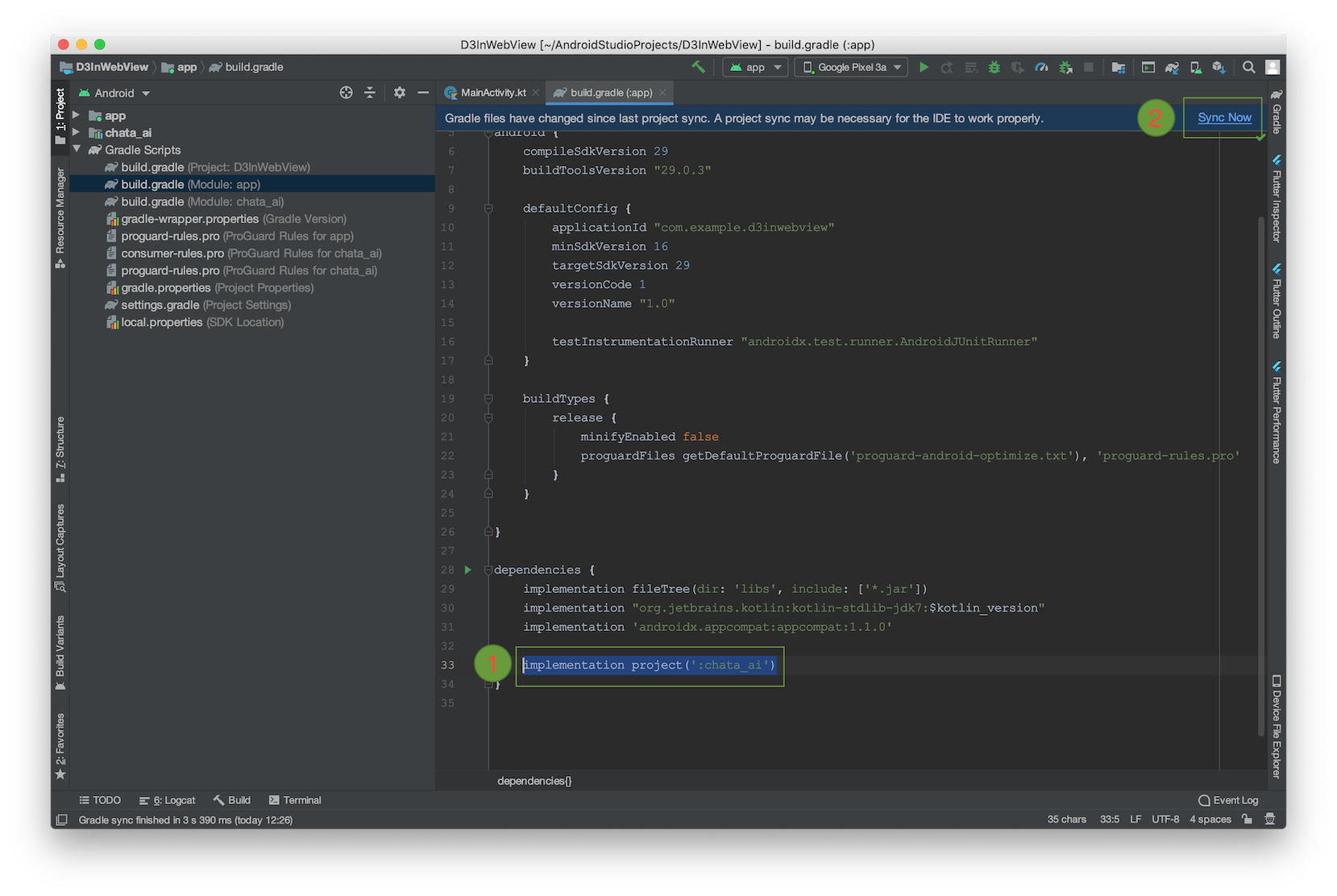
The next step is to add the library to our build.gradle (Module: app) file.
To do this, add the line implementation project (': chata_ai'), then click on Sync now to synchronize the library with your project.
Add source code in project
Let's start with the declaration and initiation of the variable bubbleHandle (BubbleHandle).
The Authentication object is the container for the apiKey, domain URL, and JWT.
import androidx.appcompat.app.AppCompatActivity
import android.os.Bundle
import chata.can.chata_ai.view.bubbleHandle.Authentication
import chata.can.chata_ai.view.bubbleHandle.BubbleHandle

class MainActivity: AppCompatActivity() {
  private lateinit var bubbleHandle: BubbleHandle

    override fun onCreate(savedInstanceState: Bundle?) {
    	super.onCreate(savedInstanceState)
      setContentView(R.layout.activity_main)

      val authentication = Authentication("", "", "")
      bubbleHandle = BubbleHandle(this, authentication)
    }
}
To use this component, it's necessary to make some decisions regarding the version of the device.
First, we are going to determine if the device where our application will be executed is equal to or greater than Marshmallow.
private fun isMarshmallow() = Build>VERSION.SDK_INT >= 23Another thing that needs to be considered is the on-screen overlay. For this, we must give the application permission to see the BubbleHandle element on our screen.
See below to evaluate whether the overlay is active for our application:
@RequiresApi(api = Build.VERSION_CODES.M)
private fun canDrawOverlays() = Settings.canDrawOverlays(this)
For better encapsulation, create the initBubble method to start our bubbleBundle.
private fun initBubbleHandle() {
	val authentication = Authentication("", "", "")
  bubbleHandle = BubbleHandle(this, authentication)
}
Now, if the user has not accepted the screen overlay permissions for our application, we are going to call an intent so that the user can accept it. In turn, we're going to read the result once the user exits the overlay permission screen.
Once the user accepts the permissions, we can start the BubbleHandle component:
override fun oncreate(savedInstanceState: Bundle?) {
  super.onCreate(savedInstanceState)
  setContentView(R.layout.activity_main)

  // once the activity is created, the Android version that runs our repository is evaluated, if it is equal to or greater than Marshmallow we will check  'if'  otherwise we start our BubbleHandle
  if (isMarshmallow()) {
    // in the second ʻif` statement we check the screen overlay for our App, if it has not been accepted we show the overlay permission screen.
    if (!canDrawOverlays()) {
      with(Intent(
        Settings.ACTION_MANAGE_OVERLAY_PERMISSION,
        Uri.parse("package:$packageName")))
      {
        startActivityForResult(this, overlayPermission)
       }
    }
    else {
      initBubbleHandle()
    }
  }
  else {
    initBubbleHandle()
  }
}

// The response is read and checked if the user accepted the overlay permissions.
override fun onActivityResult(requestcode: Int, resultCode: Int, data: Intent?) {
	super.onActivityResult(requestCode, resultCode, data)
	if (isMarshmallow()) {
  	initBubbleHandle()
 	}
}
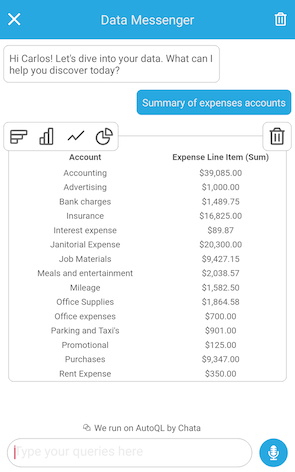
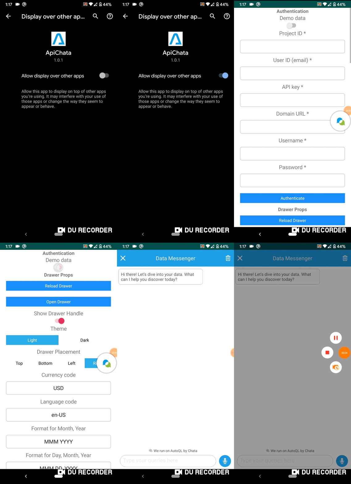
Once installed, Data Messenger should appear similar to this:
Props
| Prop Name | Data Type | Default Value |
|---|---|---|
| isVisible | Boolean | true |
| placement | Int: TOP_PLACEMENT || BOTTOM_PLACEMENT || LEFT_PLACEMENT || RIGHT_PLACEMENT || NOT_PLACEMENT | RIGHT_PLACEMENT |
| title | String | "Data Messenger" |
| userDisplayName | String | "there" |
| introMessage | String | "Hi there! Let's dive into your data. What can I help you discover today?" |
| inputPlaceholder | String | "Type your queries here" |
| maxMessages | Int | 0 |
| clearOnClose | Boolean | false |
| enableVoiceRecord | Boolean | true |
| autoQLConfig | AutoQLConfig | AutoQLConfig() |
| dataFormatting | DataFormatting | DataFormatting() |
| theme | String: "light" || "dark" | "light" |
| lightThemeColor | String | "#28A8E0" |
| darkThemeColor | String | "#525252" |
| aChartColors | ArrayList<E> | ArrayList() |
isVisible: Determines whether the Bubble Handle view is visible on the screen or not.
//isChecked is a Boolean
bubbleHandle.isVisible = isCheckedplacement: Determines the edge of the screen where the Bubble Handle is placed.
//placement is an Integer
//Constant -> TOP_PLACEMENT || BOTTOM_PLACEMENT || LEFT_PLACEMENT || RIGHT_PLACEMENT || NOT_PLACEMENT
bubbleHandle.placement = placementtitle: Text that appears in the header of the default Data Messenger view. You must provide an empty string if you do not want text to appear here, otherwise the default text (Data Messenger) will apply.
//title is a String
bubbleHandle.title = titleuserDisplayName: Name used in the intro message (example. "Hi Carlos!"). You can customize this value using names from your own application.
//userDisplayName is a String
bubbleHandle.userDisplayName = userDisplayNameintroMessage: Customize the default intro message using your own brand voice and custom copy. The userDisplayName prop will be ignored if this is provided.
//introMessage is a String
bubbleHandle.introMessage = introMessageinputPlaceholder: Customize the placeholder for the Query Input (natural language query search bar).
//inputPlaceholder is a String
bubbleHandle.inputPlaceholder = inputPlaceholdermaxMessages: Maximum number of messages that can be displayed in the Data Messenger interface at one time. A message is any input or any output in the interface. This means a query entered by a user constitutes one message, and the response returned in the Data Messenger interface constitutes another message. If a new message is added and you have reached the maximum, the oldest message will be erased.
//maxMessages is an Integer
bubbleHandle.maxMessages = maxMessagesclearOnClose: Determines whether or not to clear all messages when the widget is closed. Note: The default intro message will appear when you reopen the widget after closing it.
//clearOnClose is a Boolean
bubbleHandle.clearOnClose = clearOnCloseenableVoiceRecord: Enable the speech to text button. Note: The speech to text function uses SpeechRecognizer which works when the "Manifest.permission.RECORD_AUDIO" permission is accepted by the user.
//enableVoiceRecord is a Boolean
bubbleHandle.enableVoiceRecord = enableVoiceRecordtheme: Color theme for Data Messenger. There are currently two options: light theme and dark theme. For a light theme, declare 'light' and for a dark theme, set as 'dark'.
//theme is a String "light" else "dark"
bubbleHandle.theme = themelightThemeColor: Primary accent color used in Data Messenger. This is the color of the header, speech-to-text button, and the messages displayed in the interface (both natural language query inputs from users and the associated responses that are generated and returned to the user). The visualization (table and chart) colors will not be affected here. This color is used when the light theme is active.
//lightThemeColor is a String, its format is #FFFFFF
bubbleHandle.setLightThemeColor(lightThemeColor)
darkThemeColor: Primary accent color used in Data Messenger. This is the color of the header, speech-to-text button, and the messages displayed in the interface (both natural language query inputs from users and the associated responses that are generated and returned to the user). The visualization (table and chart) colors will not be affected here. This color is used when the dark theme is active.
//darkThemeColor is a String, its format is #FFFFFF
bubbleHandle.setDarkThemeColor(darkThemeColor)aChartColors: Array of color options for the chart visualization themes, starting with the most primary. You can pass any valid CSS color format in here, however it is recommended that the color is opaque (ex. "#26A7E9"). Charts will always apply the colors in order from first to last. If the visualization requires more colors than provided, all colors will be used and then repeated in order.
changeColor(indexColor: Int, valueColor: String): With the change Color method you will update the color in index Color and the color value of the color to update will be valueColor.
//indexColor is a Int; valueColor is a valueColor
bubbleHandle.changeColor(indexColor, valueColor)
addChartColor(valueColor: String): Boolean: Add one more color to aChartColors. The color format must be hexadecimal. (Ex. # FF00FF).
//valueColor is a String
bubbleHandle.addChartColor(valueColor)
autoQLConfig Prop
| Key | Data Type | Default Value |
|---|---|---|
| enableAutocomplete | Boolean | true |
| enableQueryValidation | Boolean | true |
| enableQuerySuggestions | Boolean | true |
| enableDrilldowns | Boolean | true |
| enableColumnVisibilityManager | Boolean | true |
| debug | Boolean | true |
enableAutocomplete: Automatically populates similar query suggestions as users enter a query, so they get results more quickly and easily. If enabled, suggested queries will begin to appear above the Query Input bar as the user types.
//enableAutocomplete is a Boolean
bubbleHandle.autoQLConfig.enableAutocomplete = enableAutocompleteenableQueryValidation: Catches and verifies references to unique data, so users always receive the data they need. If enabled, the natural language query entered by a user will first go through the validate endpoint. If the query requires validation (ex. the input contains reference to a unique data label), suggestions for that label will be returned in a subsequent message, allowing the user to verify their input before executing their query.
//enableQueryValidation is a Boolean
bubbleHandle.autoQLConfig.enableQueryValidation = enableQueryValidation
For example: If you query, 'How much money does Carlos owe me?', validation may detect that there is no 'Carlos' label, but there are labels called 'Karlo', and 'carlo' in your database. The message will then let you select the appropriate label and run the corresponding query.
If this value is false, the query will bypass the validate endpoint and be sent straight to the query endpoint.
enableQuerySuggestions: Enables option for user to clarify meaning in cases where their original query lacked context or could be interpreted in multiple different ways. If enabled, in cases where the query input was ambiguous, a list of suggested queries will be returned for the user to choose from, leading to more efficient and accurate responses. If this is false, a general error message will appear in its place.
//enableQuerySuggestions is a Boolean
bubbleHandle.autoQLConfig.enableQuerySuggestions = enableQuerySuggestionsenableDrilldowns: When a table or chart element is clicked by a user, a new query will run automatically, allowing the user to "drilldown" into the data to obtain a detailed breakdown of the figure returned by entry. If this is false, nothing will happen when a table or chart element is clicked.
//enableDrilldowns is a Boolean
bubbleHandle.autoQLConfig.enableDrilldowns = enableDrilldownsenableColumnVisibilityManager: Column Visibility Manager allows the user to control the visibility of individual columns when query results are returned in a table. Users can access the Column Visibility Manager to adjust their visibility preferences by clicking the "eye" icon in the Options Toolbar and selecting or deselecting columns. Once set, visibility preferences will be persisted. Any future query containing columns that were previously shown or hidden by the user will also reflect these changes. The user can access the Column Visibility Manager to make changes to these visibility preferences at any time.
//enableColumnVisibilityManager is a Boolean
bubbleHandle.autoQLConfig.enableColumnVisibilityManager = enableColumnVisibilityManagerdebug: If this value is true, the user can copy the full query language (QL) statement (ex. SQL statement) that was dynamically generated from their natural language query input by clicking "Copy generated query to clipboard".
//debug is a Boolean
bubbleHandle.autoQLConfig.debug = debug
dataFormatting Prop
| Key | Data Type | Default Value |
|---|---|---|
| currencyCode | String | "USD" |
| languageCode | String | "en-US" |
| currencyDecimals | Int | 2 |
| quantityDecimals | Int | 1 |
| monthYearFormat | String | "MMM YYYY" |
| dayMonthYearFormat | String | "MMM DD, YYYY" |
currencyCode: If your data is not in USD, you can specify a different ISO 4217 currency code here. All visualizations (tables and charts) will show the default currency formatting for the specified code.
//currencyCode is a String
bubbleHandle.dataFormatting.currencyCode = currencyCodelanguageCode: If the currency code from your country requires letters not contained in the English alphabet, set this to the appropriate IETF language tag to import the necessary characters.
//languageCode is a String
bubbleHandle.dataFormatting.languageCode = languageCodecurrencyDecimals: Number of digits to display after a decimal point for currencies.
//currencyDecimals is a Integer
bubbleHandle.dataFormatting.currencyDecimals = currencyDecimalsquantityDecimals: Number of digits to display after a decimal point for quantity values.
//quantityDecimals is a Int
bubbleHandle.dataFormatting.quantityDecimals = quantityDecimalsmonthYearFormat: The format to display the representation of a whole month. AutoQL uses SimpleDateFormat("format", Locale.US). Reference is available here.
//monthYearFormat is a String
bubbleHandle.dataFormatting.monthYearFormat = monthYearFormatdayMonthYearFormat: The format to display the representation of a single day. (ie. March 18, 2020). AutoQL uses SimpleDateFormat("format", Locale.US). Reference is available here.
//dayMonthYearFormat is a String
bubbleHandle.dataFormatting.dayMonthYearFormat = dayMonthYearFormat
Updated 6 months ago
